Tutorials, Tips & Tools
Prowebdesign loves giving back to the community. Read our tutorials on web design and front-end coding.
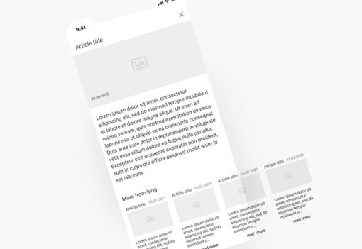
WordPress featured posts in a horizontal scrolling container.

“Free” site builders and cheap pre-made WordPress themes: why are they a bad idea.

Hosting with a reseller. Pros and cons.
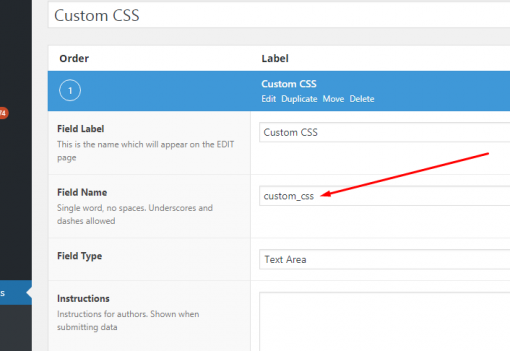
How to add page- or post- specific CSS to a WordPress theme with ACF

How to get a business website built
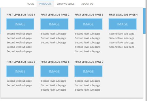
Fast & Easy WordPress Mega Menu without Plugins

How to choose and hire a good web designer
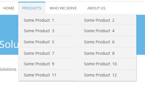
WordPress sub-menu items split in 2 columns. The easy way.

CSS shapes. Images in rounded corner square rotated to 45 degrees (rhombus).

Introduction to OOCSS and Responsive Behavior. Designing a one page site with Simple Responsive Template.
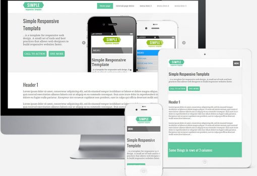
Simple Responsive Template. New freebie from Prowebdesign.
Fanurio – great activity management, time tracking, and invoicing tool for small web design companies and freelancers
SASS gradient bars with reflections
How to deal with :hover on touch screen devices
CSS3 rounded responsive drop shadows & glows