This tutorial consists of two parts. First one explains how to make glossy red menu bar (smartphone style) in PhotoShop. Second part explains how to recreate this bar in CSS3 without using any background or border images. The tutorial is for people who are regular users of PhotoShop and are on friendly terms with CSS3. But if you have no idea what’s CSS3, or how it is different from CSS2, or from any other abbreviation out there, you can just grab the source files and use them as is.
DOWNLAOD SOURCE FILES. See DEMO
PART 1. Make a bar in PhotoShop.
First of all we will create a mock-up of menu bar in PhotoShop. There’s a latest trend saying you can design directly in HTML-editor, tweaking shapes and colors along the way. This is crap. It’s like oil painting with no model and no underlying sketch.
So, lets go PhotoShop ourselves a nice glossy menu bar, which we will later reproduce in pure CSS. I will describe the process of making red glossy bar from the demo. But following the same steps, you can create any color variation you like.
- Open a new document in PS.
- Select rounded rectangle tool
 and set radius to 8px.
- Draw 600px x 50px rectangle, fill it with solid color #d50000.
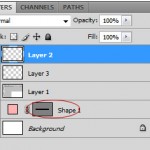
- CTRL+Click (PC) the rectangle’s shape vector mask in layer palette to make a selection.
- Click SHIFT+CTRL+N to create a new layer above the shape layer
- Open EDIT menu, select STROKE.
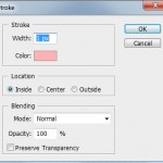
- In STROKE dialog set stroke width to 1px, color to #ffb2b2 and stroke location to Inside. Click OK. Now you got a pink outline to your bar.
Don’t deselect the shape layer.
- Create another new layer. Open stroke dialog again, and this time set color to #c30000 and stroke location to Outside. Click OK. Now we have also an outer stroke on our menu bar.
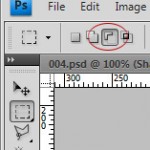
- To add glossy shading, click CTRL+Click (PC) the rectangle’s shape vector mask in layer palette to select it (if you deselected it before). then Click M to call a marquee tool (take care it’s rectangular marquee). Choose “Subtract from selection”tool
- Create a new layer right above the shape layer (under stroke layers) and click CTRL+Backspace to fill it with any color.
Now add a layer style to newly filled layer (click Fx button at the bottom of the layer palette). Choose Gradient overlay.
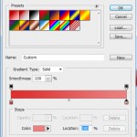
In gradient overlay dialog set left color stop to #dd3030, and right color stop to #ea8181. Keep gradient linear and it’s direction vertical (90 degrees).
Our red glossy bar should now look like this and is all ready to get CSSed 🙂
PART 2. Recreate red menu bar in CSS3 without using a single image.
Compatibility.
In this part of tutorial we’ll use CSS3 gradient background and border-radius properties and HTML5 nav element. Evidently, innovation-proof browsers like IE<10 will see just a boring solid color rectangle instead of nice glossy bar with rounded corners. To check compatibility for the rest of browsers, please visit this site (remember to look for HTML5 nav element, CSS3 gradient and border-radius properties).
Some of you may ask, why to use this method, if good ol’ one with images is bullet proof even for IE6? Well, first of all, soon enough imageless method may become the best method. One example: you’ve probably heard of new smartphones retina display, which density is higher than that of conventional displays? Regular bitmaps look blurry on last generation smartphones, because of resolution differences. Designer now should create 2 sets of images for smartphones: low-res for older displays and high-res for retina display. CSS3, on the other hand, is resolution independent and looks good everywhere.
Secondly, imageless way is plain faster, neater and more fun!
And, last but not least, everybody should learn new stuff:)
So, let’s get to it.
First, let’s prepare HTML5. Create a new HTML document in your favorite editor, save it and paste this code into it:
<!DOCTYPE html>

<head>
<meta http-equiv="Content-Type" content="text/html; charset=utf-8" />
<title>Red menu bar</title>
<style type="text/css">
<!--
body {
 margin:10px;
 padding: 10px;
}
-->
</style></head>

<body>
 <nav>
 <ul>
 <li><a href="#"> fisrt menu item</a></li>
 <li><a href="#"> bleah menu item</a></li>
 <li><a href="#"> bleah bleah</a></li>
 <li><a href="#"> bleah</a></li>
 <li><a href="#"> last menu item</a></li>
 </ul>
 </nav>
</body>
</html>
In the next steps, we will just be adding more CSS declarations after body{} selector.
Now, let’s give a gradient background and rounded corners to the nav element. Copy and paste this CSS code right under the
body {
margin:10px;
padding: 10px;
}
nav{
 display:block;
 width:600px;
 height:50px;
background:#d50000;
background-image: -webkit-gradient(
 linear,
 left bottom,
 left top,
 color-stop(0.5, rgb(213,0,0)),
 color-stop(0.51, rgb(221,49,49)),
 color-stop(1, rgb(234,130,130))
);
background-image: -moz-linear-gradient(
 center bottom,
 rgb(213,0,0) 50%,
 rgb(221,49,49) 51%,
 rgb(234,130,130) 100%);

-moz-border-radius: 8px;
border-radius: 8px;

border:#c30000 1px solid;
}
This tutorial doesn’t set explaining CSS3 gradients as its goal. So, if you are not familiar with the concept, you should find a detailed tute dedicated to this property. This is one of them. Assuming that you ARE familiar with CSS3 gradients, I just would like to point out that our gradient has an abrupt change of color right in the middle of the bar. That’s why we used color stops at 50% (0.5) for the first color and 51% (0.51) for the second color. If you want colors to degrade less abruptly, set those 2 color stops further apart.
If you want to play around with gradients or recreate quickly and easily gradients, which you created in PhotoShop, I recommend you use this tool. It’s easy, it’s great and it lets you generate any CSS3 gradient code in seconds! I have used it to generate the above code.
Under the background-image declarations you see the self explanatory border-radius properties. I’ve set it’s value to 8px to recreate my PhotoShop bar exactly. You can use any value, of course.
Also, in the last line of code (border:#c30000 1px solid;) we have set the bar’s outer border color and width.
We are almost done. The only thing left is to create the inner pinkish border. The easiest way to do it is to style the ul element of the unordered list of menu items. Copy and paste this code after the nav{} styles:
nav ul{
 display:block;
 width:598px;
 height:48px;
 -moz-border-radius: 8px;
 border-radius: 8px;
 border:#ffb2b2 1px solid;
 margin:0px;
 padding:0px;
}
nav ul li{
 display:inline;
 margin:0px;
 padding:0px;
}
nav a{ display:block; float:left;
padding:0px 19px;
line-height:4em;
font-family:Verdana, Geneva, sans-serif;
color:white;
font-size:.73em;
text-decoration:none;
}
nav a:hover{color:#ffb2b2;}
This is pretty regular list menu styling code. 2 thisgs to pay attention to, though:
1. Width and height of ul element is exactly 2px less than width and height of nav element. This makes the inner stroke to appear INSIDE the outer stroke.
2. Don’t forget to give ul element the same rounded corners as to nav element (-moz-border-radius: 8px;
border-radius: 8px;).
And that is all:)
Compatibility tips:
To make HTML5 and CSS3 more cross browser compatible, you can use the famous HTML5 Boilerplate system, or simply html5shiv or modernizr scripts.
Here’s one more nice script to make CSS3 more browser compatible: CSS3 Pie script.
Also you can create a separate set of rules for IE with image background for the bar.


