
Working on web projects I used to run into 2 problems time and again. First problem applies to any web design project: as the project grows bigger, CSS gets messier. There was obviously a need for some kind of better system of writing CSS. Second problem applies to responsive websites. The problem is that solely CSS media queries are not enough to make a website truly responsive. Truly responsive website will not only look, but also behave in a responsive way. That means – if we will simplify things a lot – it will serve different assets to different devices. In this tutorial I would like to show you the solutions to those problems, which I think are awesome: OOCSS (stands for Object Oriented CSS) and Responsive Behavior.
We will be making a one page website with Simple Responsive Template. Original Simple Responsive Template is intended for novice or beginner web designers, or non-web designers. It is coded in a way that is easy for them to read – with minimum level of abstraction. We will be using Simple’s HTML and CSS structure, stripped to the bare minimum to build something a bit more advanced. Download the starter project files.
Create a one page website and write CSS the OOCSS way.
Let’s imagine you’ve made yet another weather app – just what the world needs:). But your app is wonderful, and innovative, and best of them all. It predicts weather for chosen location, for example. Let’s build a one-pager website to promote it.
Structure we want:
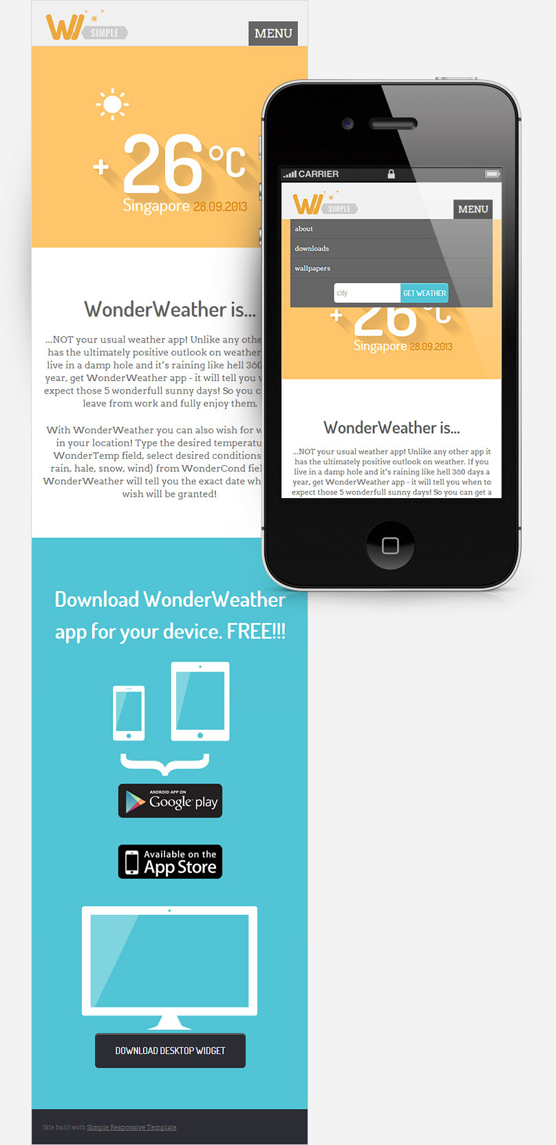
- Fixed header with logo, navigation bar, and search field for locations. Navigation bar links will be anchors and will initiate scroll to page sections on click. Navigation bar will turn into toggle menu on smaller screens.
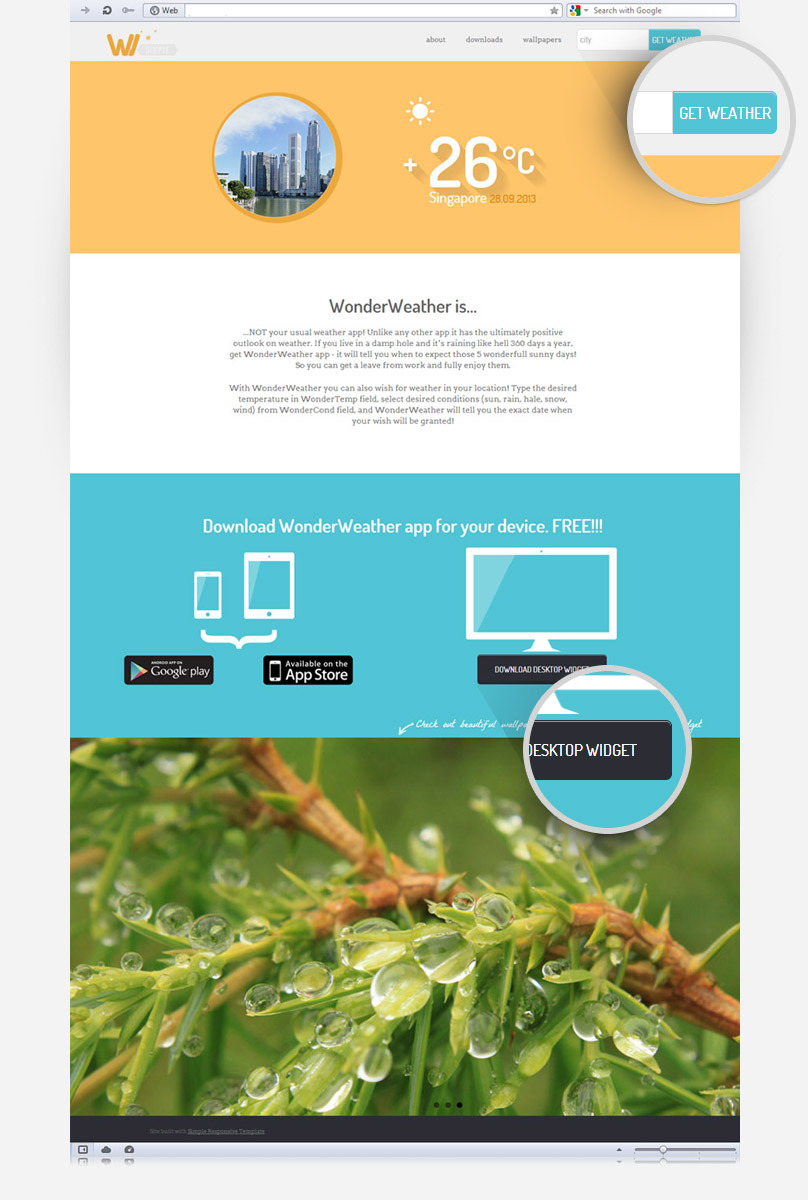
- Hero area with weather info for a certain city: city picture and weather widget.
- About app section
- Downloads app section
- Desktop wallpapers demo section
- Footer.
Here are the mock-ups for our one-pager. I don’t believe in design-in-browser concept, because it eliminates the Planning Phase. When designing responsive ALWAYS make at least 2 mock-ups: for desktop and for smart-phones. Click to enlarge.
Open the project files you’ve downloaded and inspect the HTML file. HTML is fully set up, because it is CSS we are mostly interested in (there’s also enough basic CSS to jump start the project without writing everything from zero). Still, there are some things to observe in HTML.
Look at the code for blue GET WEATHER button in the header: <input type="button" name="get_weather_btn" value="get weather" />. Wonder why weird class naming, and why so many classes, especially since DOWNLOAD DESKTOP WIDGET button below has just one class: <a href="#" class="button">Download desktop widget</a>? You may argue that no classes are needed for blue button at all, since we have an id on the ancestor container, or if ancestor is a semantic HTML element, like <header>. If we adopt this reasoning, how will the CSS for those buttons look?
header button{}
#download .button{}
What’s wrong with this code? Technically – nothing. But…
- What if you want to have blue button in some other place than the header? You will need to write more styles for that button.
- What if you want to have blue button with all corners rounded? You will need to write more styles for that button.
- What if you want to have dark grey button outside of Downloads section? You will need to write more styles for that button.
We’ve identified the first problem that we will solve with OOCSS: elements should not be styled based on their position in the document. You may want to move them to another container – and they still must look the same. So you should avoid:
- two- or more- parts selectors,
- including parent selectors in the element style
There are ways to gradually improve this code to achieve better portability, but we will do it the proper OOCSS way right now and then discuss the code.
To understand what happens better, look at the design mock-ups. We have 2 buttons: the blue one and dark grey button for DOWNLOAD DESKTOP WIDGET. What styles do they share? Font face, size, and color; white emboss on top, hover state functionality. And what is different: background, size, border-radii. One is a button element, the other is a link.
/*OOCSS way:*/
.button{}
.button--blue{}
.button--submit-right-attached{}
We have chosen dark grey button as “default” button. Every style needed for having a dark grey button anywhere in the site will go into the .button class. This class has no combinators, so it can be applied to any HTML element: link, button, whatever. Then to make the blue button we will modify the dark grey button. All styles that make blue button different will go into the MODIFIER class .button--blue{}. We will add enough styles to override: background, border color…and that is all. And this way we get a normal rounded button – same size and all – but blue!
Lastly, we create modifier class to have a smaller blue button with only 2 rounded corners, that will be floating next to some text field – on the right side. Final buttons code for our project looks like this:
.button{
display:block;
position:relative;
z-index:20;
padding:18px 20px;
max-width:260px;
margin:0 auto;
border-radius:6px;
font-family:"Dosis", Arial, Helvetica, sans-serif;
font-weight:500;
text-transform:uppercase;
text-decoration:none;
text-align:center;
background:#2b2d34;
border:1px solid #2b2d34;
color:#fff!important;
box-shadow: inset 0px 1px 0px 0px rgba(255, 255, 255, .5);
}
.button:hover{ background:#000;}
.button--blue{background:#51c4d4; border:1px solid #51c4d4;}
.button--blue:hover{background:#3fb0c0;}
.button--submit-right-attached{padding:0 5px; height:43px; border-radius:0 6px 6px 0; float:left;}
You’ve probably noticed that we used a certain naming convention. You can use any. I use one suggested by Philip Walton in his great article http://engineering.appfolio.com/2012/11/16/css-architecture/ on OOCSS. Put those at the top of your CSS in comments like a cheat sheet.
/* NAMING CONVENTION
***Component Rules
.component-name /*use hyphen to separate words, verbose descriptive class names are OK!*/
.component-name--modifier-name  /*modifier classes are separated from classes they modify by -- */
.component-name__sub-object /*sub object is a class that lives within another class - a child class*/
.component-name__sub-object--modifier-name
*/
So, what have we achieved with our OOCSS buttons?
- They are portable – reuse them in this site or in other sites you build.
- They are readable – if other developer sees this code, he/she will understand it easily.
- They are scalable – extending and modifying them is super-simple. Want to have a red button? Just add a modifier .button–red. Etc.
This is what OOCSS is all about: creating components, that are independent of the document context.
Many developers frown on OOCSS because of the bunch of classes you will need to apply to your HTML. Advocate of semantic approach will argue that you pollute your HTML and make CSS “mix into” HTML too much. In reality, semantic approach is the one that ties your CSS to HTML more. Because it relies on semantic elements, IDs or even attributes for creating CSS selectors, semantic CSS requires intimate knowledge of HTML it is written for. Once HTML changes, the CSS begins behave unpredictably.
But, on with our weather site. Let’s paste the buttons code in onepage-start-style.css. Before pasting look at the file’s structure. There are our media queries, that create sections of the document. But there are also comments that create even more sections. Those sections are BASE, LAYOUT, MODULES, and THEME. If you look at the styles declared there you will understand what this is all about at a glance. Structuring your code like this is a good idea. As the CSS document grows, it will be easy to keep track of where to add this or that new class. So, BASE are universal styles, resets, typography, so on. LAYOUT styles are ones for site’s mainframe, big chunks that have lots of children nodes: header, large sections, footer, grids. MODULES are majority of classes: navigation, any widgets, buttons, containers, alerts, etc., etc. THEME styles are colors. Plan THEME styles so that you can substitute them and nothing on your site will fall apart, but just will be colored in a different way. This separation of styles was suggested by Jonathan Snook, author of a must read http://smacss.com/
Where were we? We wanted to paste our buttons somewhere! And now you can guess that they will go into the MODULES group. Let’s quickly style the text fieldlue button it is attached, while we are at it. Paste this line of CSS somewhere before or after the buttons block:
.weather-form{width:250px; margin:0 auto;}
.weather-form__get-weather{float:left; width:145px; border:1px solid #d9d9d9; padding:0 5px; height:43px; border-radius: 6px 0 0 6px; }
Now we can move on to the Hero Area and face truly scary weather widget that lives in it. But first take a quick look at the section code itself: <section id="hero" class="background-yellow clearfix">. See .background-yellow class? Now look at the other sections. Downloads has class .background-blue, header has .background-lightgrey, footer has .background-grey. Why bother and give those classes to those large sections, while we could have just declared background color in their ID selectors? The OOCSS answer – because you can apply classes to anything, you can reuse and combine them, while you can NOT reuse IDs. May be you will want to have more the one blue areas at some point, then what? Answer – use classes. Put those classes in the THEME section of your CSS:
.background-blue{ background:#51c4d4; color:#fff;}
.background-grey{ background:#2b2d34;}
.background-lightgrey{ background:#f0f0f0;}
.background-yellow{ background:#ffc56a; color:#fff;}
Back to hero section.
Empty div with class .city-image is the container for the round picture of Singapore. Since it will only be visible for devices with larger screens, go ahead and add this to the MODULES section of our universal classes (before media queries):
.city-image{ display:none;}
Then add this to the 920px media query:
.city-image{ display:block; float:left; width:40%; height:266px; margin-right:10%; background:url(../images/onepage-singapore.png) top right no-repeat;}
Next comes really classy weather widget:
</pre>
<div class="weather-widget">
<div class="weather-widget__weather-icon icon" data-icon="1"></div>
<div class="weather-widget__temperature-sign background-yellow__longshadow">+</div>
<div class="weather-widget__temperature-digits background-yellow__longshadow">26</div>
<div class="weather-widget__temperature-system background-yellow__longshadow">°C</div>
<div class="weather-widget__city">Singapore</div>

28.09.2013</div>
<pre>
But don’t worry, it is not as bad as it looks. Let’s read the classes. .weather-widget is the component or module class. Rest of things that live inside it are named according to our convention. See the classes on the div on line 2 of the code above? Because it has “__” in its name, we know that it is a child that lives inside its parent .weather-widget, and it’s name is .weather-icon. But why another .icon class? Well, it is thanks to Alessio Atzeni and his project Meteo Icons , that we can use .icon class with data-ico attribute and get a sun weather icon up in seconds! MeteoIocns font face and icon styles are already included in the BASE styles section of your CSS. Meteo font is in meteocons-font folder of our project. Really class-intense div on line 3 has something unusual in it. What is background-yellow__longshadow class? It doesn’t have weather-widget in its name? Is it a mistake? Well, no. This class is from another group of styles – the THEME styles. Remember .background-yellow class? .background-yellow__longshadow is its child class. It can be applied to any text, that is displayed on yellow background, and this text will get an awesome long shadow. Thanks to Juani for the long shadow generator . Next 2 divs also have the long shadow class. Last 2 divs are self explanatory. Now let’s paste those classes into the MODULES section at the top of CSS:
.weather-widget{width:270px; margin:30px auto 0;}
.weather-widget__weather-icon{ font-size:70px; width:270px; margin-bottom:70px;}
.weather-widget__temperature-sign{ float:left; width:50px; font-size:70px; font-family:"Dosis", Arial, Helvetica, sans-serif; font-weight:600; }
.weather-widget__temperature-digits{float:left; width:150px; font-size:140px; font-family:"Dosis", Arial, Helvetica, sans-serif; font-weight:600; }
.weather-widget__temperature-system{float:left; width:70px; font-size:70px; font-family:"Dosis", Arial, Helvetica, sans-serif; font-weight:600;}
.weather-widget__city{float:left; width:102px; margin: 53px  0 0 53px; font-size:30px; font-family:"Dosis", Arial, Helvetica, sans-serif; font-weight:500;}
.weather-widget__date{float:left; margin: 56px  0 0 20px; font-size:22px; font-family:"Dosis", Arial, Helvetica, sans-serif; font-weight:500; color:#dc8804;}
And paste this inside 920px media query:
.weather-widget{ float:left;}
Then paste the long shadow thing after .background-yellow class in the THEME section:
.background-yellow__longshadow{ /*Thank you, http://sandbox.juan-i.com/longshadows/*/
 text-shadow: rgb(230, 177, 95) 1px 1px,
 rgb(230, 177, 95) 2px 2px,
 rgb(230, 177, 95) 3px 3px,
 rgb(230, 177, 95) 4px 4px,
 rgb(230, 177, 95) 5px 5px,
 rgb(230, 177, 95) 6px 6px,
 rgb(230, 177, 95) 7px 7px,
 rgb(230, 177, 95) 8px 8px,
 rgb(230, 177, 95) 9px 9px,
 rgb(230, 177, 95) 10px 10px,
 rgb(230, 177, 95) 11px 11px,
 rgb(230, 177, 95) 12px 12px,
 rgb(231, 178, 95) 13px 13px,
 rgb(232, 179, 96) 14px 14px,
 rgb(234, 180, 96) 15px 15px,
 rgb(235, 181, 97) 16px 16px,
 rgb(236, 182, 98) 17px 17px,
 rgb(238, 183, 98) 18px 18px,
 rgb(239, 184, 99) 19px 19px,
 rgb(241, 185, 99) 20px 20px,
 rgb(242, 187, 100) 21px 21px,
 rgb(243, 188, 101) 22px 22px,
 rgb(245, 189, 101) 23px 23px,
 rgb(246, 190, 102) 24px 24px,
 rgb(248, 191, 102) 25px 25px,
 rgb(249, 192, 103) 26px 26px,
 rgb(250, 193, 104) 27px 27px,
 rgb(252, 194, 104) 28px 28px,
 rgb(253, 195, 105) 29px 29px,
 rgb(255, 197, 106) 30px 30px;
}
Look at the onepage-start.html in the browser – we are getting there!:) Header and hero areas look as intended now. Moving on to the about and downloads sections. Text & elements’ alignment doesn’t match the design mock-ups – we need to center our stuff. How would you do it the usual way? Probably like so:
#about,
#downloads{text-align:center;}
Perfect code. Terse, to the point. But let’s look at it from the OOCSS perspective. What if you will want to center-align things in other containers? We don’t have many other containers in our example one-pager, but what if your website will grow more pages in the future? We better prepare for this scenario now and create a class that does nothing, but center-aligns, and put it somewhere at the end of the BASE classes:
.centered-text{text-align:center;}
This class is already applied to the about and downloads section in HTML, so now everything is centered. Next thing to get in accordance with design is the <p class="wallpapers-teaser handwriting">Check out beautiful wallpapers that come with WW desktop widget</p> paragraph. As you see, it has 2 classes. This small piece of code is a perfect example of another OOCSS principle: separate styles that set element’s position and size from styles that “theme it”: colors, font face, etc. Class .wallpapers-teaser will be responsible for position and size, class .handwriting will contain the font-face and size. What will we achieve by such separation? We will gain a class that can be reused on other elements – the .handwriting class. There’s also a little hand drawn arrow that points downwards. Where shall we put it? Well, since we are pretty sure that this arrow will appear in the site just this once, we will put it in a class we don’t intend to reuse: .wallpapers-teaser. Here’s the CSS code for it:
.wallpapers-teaser{
	display:block;
	width:auto;
	position:absolute;
	bottom:-130px;
	right:0;
	text-align:right;
	padding:0 0 10px 40px;
	background:url(../images/onepage-arrow.png) bottom left no-repeat;
}
Put this declaration under the MODULES section. And here’s CSS for the .handwriting class:
.handwriting{
	font-family:"La Belle Aurore", Arial, Sans;
	font-size:22px;
}
Insert it under the THEME section. Reload onepage-start.html in the browser. Finally everything is in place and looks just like we intended!
Conclusions for OOCSS.
You could have written CSS for this one-pager in several ways, but let’s recap what the OOCSS method gave us:
- Reusable CSS. You can use your classes as building blocks to quickly style any HTML element.
- Maintainable CSS. When you need to add new new HTML mark-up, or rearrange existing one, you don’t need to rethink entire CSS flow, or begin throwing new slap-on classes at the end of you CSS document. You have a good structure that “shows” you how things should evolve. You have your sections and your naming convention. Use it, and you’ll be mess-safe.
- Readable CSS. If you design sites for clients or work with team of developers, eventually your CSS will fall into someone else’s hands. And now this some one else will be able to easily read your CSS.
Rules of thumb for coding CSS the OO way:
- Avoid using multi-part rules whenever possible. Bad:
.nav li li a. Good:.nav-dropdown a. - Avoid using ID selectors on any rule that is not in LAYOUT section of CSS document.
- Choose a naming convention and stick to it.
- Name classes descriptively so not only you, but any other coder would understand what this class does.
- Plan your project well. Before you code, take your time, look at the mock-ups and identify repetitive patters, that can be made into building-block classes.
- Whenever possible separate styles that describe element’s position and size from styles that describe color, fonts and other “prettifying” things. Put prettifying styles into THEME classes.
We’ve just created a tiny one-pager site, and benefits of OOCSS may not be clear to you yet. But try applying what you learn now to a larger project – you’ll see the light:). This is larger projects that made me realize at some point that I need a better system of writing CSS. Larger projects are the ones that quickly snowball into a CSS messy-mess, when you begin to forget what this class is doing, or cease to understand why the heck this div has this margin. More so if several people work on one big site or app. Here’s a little reading list to help you learn more about well structured CSS and OOCSS:
And now we will move on and speak a little about Responsive Behavior.
Responsive Behavior
Responsive Behavior is not a technique in itself. Responsive behavior is what you get after applying some techniques. Let’s get back to learning by example. In the wallpapers section of our one-pager we have a FlexSlider that works just fine. The problem is that it’s served to all devices, and that means that fairly large pictures inside it will be downloaded by every user, including people on phones and slow 3G. Besides, on small screens slider looks tiny and unimpressive. So we obviously should hide it from devices with small screens. What would be your first impulse in this direction? Would it be writing .flexslider{display:none;} at the beginning of CSS document and then putting .flexslider{display:block;} in 920 mediaquery? Wrong! Don’t say things like this out loud:). This is a bad way, because – if you didn’t discover this yet – display:none doesn’t prevent browsers from downloading everything that is inside the hidden container. Meaning that all the images will still be downloaded, but hidden. Another idea is to rewrite the slider in such a ways that images do not actually sit in <li></li>, but are set as backgrounds from CSS. In this case you can do the .flexslider{display:block;} in 920 mediaquery, and insert background images there as well. Solves the download problem, but creates a bunch of other problems. Not all sliders work well with backgrounds. And if your site is dynamic, and the admin can edit the slider pictures, then CSS background solution is hard to code in most CMSs. Besides, it looks like a hack:). What would be the good way to solve this problem? The answer is: don’t just hide or show content depending on screen size, actually inject or unload content depending on screen size. – This is Responsive Behavior in a nutshell. Right now Responsive Behavior is the best solution for the following problems:
- Responsive images –
srcsetattribute orpictureelement have not been implemented widely yet (at the time this article is written). - Some content is intended only for devices with certain capabilities. E.g.: you have some kind of GPS-related module.
- Sometimes you need to seriously re-tailor the entire functionality of a site or app for smaller screens. The best example is an online shop.
Back to our slider. Let’s make it to be injected into onepage-start.html only if screen is at least 920px wide. I have already set up a “marker” in CSS. Look into the 920 media query:
body:after {
	content: 'large';
	display: none;
}
A simple trick to output something on large screen that can be read by JavaScript. JavaScript will be the one to work the magic, of course. But first copy and cut the FlexSlider code from the onepage-start.html:
</pre>
<div class="flexslider">
<ul class="slides">
<li><img alt="" src="images/onepage-pic1.jpg" /></li>
<li><img alt="" src="images/onepage-pic2.jpg" /></li>
<li><img alt="" src="images/onepage-pic3.jpg" /></li>
</ul>
</div>
<pre><img src="data:image/gif;base64,R0lGODlhAQABAIAAAAAAAP///yH5BAEAAAAALAAAAAABAAEAAAIBRAA7" data-wp-preserve="%3Cscript%20type%3D%22text%2Fjavascript%22%3E%2F%2F%20%3C!%5BCDATA%5B%20%2F%2F%20Fireup%20the%20plugins%20%24(document).ready(function()%7B%20%2F%2F%20initialise%20slideshow%20%24('.flexslider').flexslider(%7B%20animation%3A%20%22slide%22%2C%20start%3A%20function(slider)%7B%20%24('body').removeClass('loading')%3B%20%7D%20%7D)%3B%20%7D)%3B%20%2F%2F%20%5D%5D%3E%3C%2Fscript%3E" data-mce-resize="false" data-mce-placeholder="1" class="mce-object" width="20" height="20" alt="<script>" title="<script>" />
and paste it into a new HTML file. Make this file blank – no <html>, <head> or <body> tags – for simplicity’s sake. Just paste the slider code. Name this file onepage-flexslider.html
Next, in our onepage-start.html we will write a small piece of JS that will probe for screen size and, if it sees the “large” word, inject the onepage-flexslider.html into wallpapers section.
Insert this before closing <body> tag:
<img src="data:image/gif;base64,R0lGODlhAQABAIAAAAAAAP///yH5BAEAAAAALAAAAAABAAEAAAIBRAA7" data-wp-preserve="%3Cscript%20type%3D%22text%2Fjavascript%22%3E%2F%2F%20%3C!%5BCDATA%5B%20var%20largesize%20%3D%20window.getComputedStyle(document.body%2C'%3Aafter').getPropertyValue('content')%3B%20if(largesize%3D%3D%3D'large')%20%7B%24('%23js-insert-wallpapers').load('onepage-flexslider.html')%3B%7D%20%2F%2F%20%5D%5D%3E%3C%2Fscript%3E" data-mce-resize="false" data-mce-placeholder="1" class="mce-object" width="20" height="20" alt="<script>" title="<script>" />
To see jQuery load() in action, you need to upload the files to the server. FTP things up and voila – see how it loads if the screen is large. This solution is taken from this great article: http://mobile.smashingmagazine.com/2013/06/12/building-a-responsive-web-application/ by Lars Kappert.
Of course we just barely scratched the surface here. The code doesn’t even take care of orientation change or window resize – you need to refresh the page to see how slider loads or how it doesn’t if the screen/browser window is smaller (there’s a bit more sophisticated code in the onepage.html which you can download). But the area of Responsive Behavior is so vast and there are so many scenarios, that offering chunk of code as an ultimate solution doesn’t even seem logic.
What I wanted to achieve is to make you aware of RWD limitations. RWD alone can not make a site, less so web app, truly responsive. I encourage you to take a look at RESS. RESS is an acronym for Responsive Design + Server Side Components. Term was introduced by Luke Wroblewski, but the concept was around for a while.
Here’s the starter reading list for learning about drawbacks of RWD, RESS, and Responsive behavior:
- Five responsive webdesign pitfalls to avoid
- RESS: Responsive Design + Server Side Components
- Getting started with RESS
- Facing The Challenge: Building A Responsive Web Application
Hope this was useful or at least thought provoking:). You can download a bit more polished final project files at the top of the page.