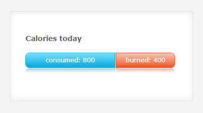
 SASS is great! Not only because it makes writing CSS easier, but also because it forces you to be more organized in your design work. If you make glossy bars in CSS like ones in the picture, you tend to use at least 3 color shades: two for gradients, one more for border. But with wonderful SASS color functions you immediately begin to think: can I optimize it somehow? Yes, you can! You can use just one color to create both gradient bar with border and its reflection.
In this tutorial I will show you how to create colorful bar charts with just one color variable for each. Well, one and a half :).
Before we start, I need to mention that I’ve chosen to create bar reflections with CSS3 linear gradients. You probably know that Webkit has a special property -webkit-box-reflect, which can create reflections of anything with one line of code. But since it only works on Webkit, we will not use it (except once for fun in the end). Linear gradients have a decent browser support, and for the visual effect we intend to make they are the best choice.
SASS gradient bar charts and reflections created with :after pseudo element and linear gradients.
Open archive with source files and inspect them. Index.html contains general styles that are not important for the tutorial, they can be replaced, deleted or altered in any way. There are just 2 things to observer there. .container is the class for div that holds the bars. Lets take a look at it:
.container{
	position:relative;
	z-index:-2;
	background:#fff;
	width:40%;
	min-width:360px;
	margin:40px auto;
	padding:30px 30px 45px 30px;
	-webkit-box-shadow: inset 0 0 20px rgba(0,0,0,0.1);
    box-shadow: inset 0 0 20px rgba(0,0,0,0.1);
	border:1px solid #e7e7e7;
}
- It is imperative that bars’ parent container has a
positionproperty (lines 2 and 3 of the code snipplet). Otherwisez-indexproperty will not work.z-indexof.containeris set to -2, so that parent container is “below” the bars’ reflections, which havez-index:-1. - Also remeber what background color you use for bars’ parent container (line 4), because it will be the second gradient color stop of all bar reflections.
Now inspect the scss files. I’ve created 2 partials, which will be imported into the style.scss: _normalize and _mixins. The latter is the only one we are interested in. Let’s go through the code in _mixins.scss.
Variables
First I’ve created all the color variables for the project.
/*********************
VARS
*********************/

$general-background-color:	rgba(255,255,255,0);
$text-color:	#fff;

/* bar colors */
$blue:		rgba(0,169,224,1);
$red:		rgba(239,85,40,1);
$green:		rgba(100,182,33,1);
$orange:	rgba(240,127,5,1);
$purple:	rgba(148,6,207,1);
First variable (line 5) is $general-background-color. This is the color of background on which the bars are placed. All bar reflections will fade into this color, so we will be using it as second color stop to create bar reflections’ gradients. Because second color stop needs to be fully transparent, $general-background-color is set with RGBA. Actually, we will be using RGBA for almost all colors, because it allows us to set opacity.
RGBAs: Take rgba(0,169,224,1). Reds: 0. Greens: 169. Blues: 224. Opacity: 0. Opacity takes values from 0=totally transparent, to 1=totally opaque. E.g. 0.5 is half see-through.Second variable $text-color (line 6) defines color of the text inside the bars.
Rest of the variables are the bar colors. You can use any colors here. If you are not sure how to define color in RBG, just use PhotoShop color picker tool and copy values from here. Or use Colorzilla Eyedropper or Gradient generator.
Moving on to mixins.
First one – @mixin border-radius – is self explanatory.
Next I created mixin that will generate gradient backgrounds (both bars and reflections).
/* gradient backgrounds and reflections */
@mixin css-gradient($from, $to, $start, $end) {
	background: $to;
	background: -webkit-linear-gradient(top, $from $start, $to $end);
	background: -moz-linear-gradient(top, $from $start, $to $end);
	background: -o-linear-gradient(top, $from $start, $to $end);
	background: linear-gradient(to bottom, $from $start, $to $end);
}
This mixin take 4 variables. $from and $to are color stops. $from generates color at the top of the bar, $to – at the bottom. $start and $end are percent values that position the color stops.
background: $to; will generate solid color background for older browsers. Next lines define gradients for modern browsers. To keep the code short I didn’t include support for IE9 SVG, Microsoft filters or old Chrome. You can add code for those, if you wish.
Now comes the most important mixin that will set general styles for all the bars.
/* let's make an actual bar */
@mixin bar($current-color){
	display:block;
	position:relative;
	float:left;
	margin:20px 1px 20px 0;
	height:30px;
	text-align:center;
	line-height:2.3em;
	color:$text-color;
	box-shadow: inset  0px 1px 0px rgba(255, 255, 255, .5);
	-webkit-box-sizing: border-box; /* Safari/Chrome, other WebKit */
	-moz-box-sizing: border-box;    /* Firefox, other Gecko */
	box-sizing: border-box;         /* Opera/IE 8+ */
	border:1px solid $current-color;
	@include css-gradient( lighten($current-color,30%), $current-color, 0%, 100%);

	&:after
	{
		content:"";
		position:absolute;
		z-index:-1;
		top:30px;
		width:100%;
		height:100%;
		border-radius:inherit;
		left:-1px;
		padding:1px;
		@include css-gradient( transparentize($current-color,0.5), $general-background-color, 0%, 40%);
	}
}
This mixin takes one variable – $current-color – and uses it to create gradients and border. This is our ONE color for all the purposes, instead of 2 or 3 shades. Whenever you will use this mixin, you will be able to pass any color as current-color, and mixin will automatically generate all the needed shades from it. Lets take this mixin apart and comment what needs commenting.
position:relative;
We MUST position this element, because the :after pseudo element position depends on it.
float:left;
margin:20px 1px 20px 0;
Bars will float left, because you will most probably want to have them stacked, representing fractions of some data set. If you want them each on separate line, don’t float them. Margin is set so that floated bars are separated by 1 pixel.
Lines 7 – 14 are just some regular styles to shape your bars. Line 11 creates a small semi-transparent white reflection on top of the bar. Just eye candy, nothing functional.
Lines 15 & 16 is where the SASS color magic begins to happen.
This line generates the bar border. See, how we used $current-color for border color here?
border:1px solid $current-color;
This line generates the bar gradient background. We have imported the css-gradient mixin created earlier and populated it with variables.
@include css-gradient( lighten($current-color,30%), $current-color, 0%, 100%);
- First goes the
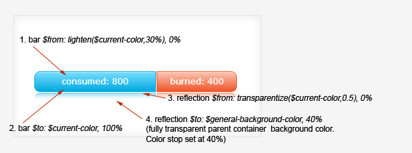
$fromcolor. This color corresponds with 1. bar $from on the picture – the topmost bar color. Because it is lighter than color on the bottom of the bar, we used SASSlightenfunction on it – and made it lighter by 30% –lighten($current-color,30%). The wonderful thing is – SASS color functions can work with virtually any color mode. In our case – RGBA. How cool is that! - Second comes our base color, unchanged. This is a
$tocolor. See 2. bar $to on the picture. - And then we have 2 color stop position values. First- 0% – is for
$fromcolor, second – 100% – for$tocolor. In human language it will about so: lighter color will start at the very top of container and will gradually transform into the darker color, becoming pure darker color at the very bottom of container.
Lines 18 – 30 of the mixin generate the :after pseudo element – bar reflection. Lines 21 – 28 are all general stuff, positioning and styling, usual for this kind of generated content. On thing worth mentioning is line 26 border-radius:inherit;. It tells pseudo element to use exactly the same border-radius values as its parent element.
Line 29 is the last piece of SASS color magic.
@include css-gradient( transparentize($current-color,0.5), $general-background-color, 0%, 40%);
It generates the reflection. Ultimately, any reflection is a flipped version of element that casts it. So, the color from the bottom of the bar will go on top of the reflection. Bar’s $to color becomes reflection’s $from color. This color is $current-color. But! I suppose you would want to make it a little bit more transparent, so it mimics real world reflections that fade on opaque surfaces? SASS can do it! We just take the $current-color and use SASS transparentize function on it like so: transparentize($current-color,0.5). I transparentized color by half, you can play around and choose a different value.
Bar reflections fade into parent container background. That is why for the second color stop we use $general-background-color. As you remember, it is a fully transparent white. And because I wanted reflections to fade pretty fast, I have positioned second color stop at 40%. It means that gradient will change into transparent white after 40% of container height.
For reflection $from and $to colors see 3. reflection $from and 4. reflection $to on the picture above.
Why you’ve got to love SASS!
At this point you may think: wow, this is a LOT of code. What did we gain by using SASS instead of CSS? Well, let me remind you that we were organized, and used only ONE color + white to generate:
- bar gradient background
- bar border
- bar reflection
But the bestest awesomeness is yet to come. Remember that we have set 5 color variables for bars in the beginning of _mixins? Now its time to use them.
In index.html I’ve create several bars. Each of them has class .bar that sets the main parameters. And another class .*color-something*-bar that sets the color.
Now look at the _mixins. Instead of repeating some 7-10 lines of code to generate new gradients and borders for each bar, we have THREE lines of code per bar. And that’s it. From this point on you can create countless color variants for your bars with 3 lines of code each. This is what SASS is all about. Thorough set up, and easy rolling:).
Let’s take a look at the .blue-bar class.
.blue-bar{
	@include bar($blue);
	width:59%;
	@include border-radius(8px 0 0 8px);
}
Line 2 is the beauty. You import all the styles of mixin bar($current-color), and pass value of variable $blue to the $current-color. And here you got your blue bar, so nice:). Pass $red to $current-color and you’ll have red var, and so on.
Line 3 sets the width of the bar segment. I have set width in SASS. Normally, it will be a dynamic value, and will be either set in JavaScript of taken from a database. It can be injected virtually anywhere, including an inline style of the respective bar segment.
Line 4 sets border-radii of the segment, depending on it’s positing in the stack.
Bonus track
I have created the last blue bar just to demonstrate how technique from this tutorial can be combined with Webkit box reflection. Use Chrome or some other Webkit browser to see it.
SASS for the last bar:
.blue-bar-rtext{
	@include bar($blue);
	width:100%;
	@include border-radius(8px);

	&:after{
		@include css-gradient( transparentize($blue,0.2), $general-background-color, 0%, 100%);
		}
	& span{
		display:block;
		-webkit-box-reflect: below 3px;
		}
}
As you see, I have overriden the .bar mixin @css-gradient for the reflection, because I wanted it darker and taller. Otherwise text reflection won’t be visible.
Text reflection is created with a line of code #11. -webkit-box-reflect: below 3px; sets reflection direction and 3px offset.


