
About Simple Responsive Template (or simply Simple)
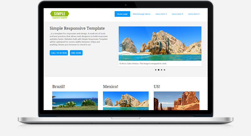
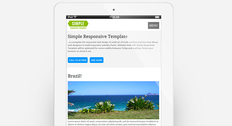
Simple is a responsive starter template. It is intended to be basic and bare-bone, with minimum styling and options included. Still, it has features clients usually would ask for: menu with drop-downs, slider, grid layout. See full list of features below.
Simple is mainly for web designers (beginner to intermediate level). But it is so simple (pun intended:) ), that any person with very little knowledge of HTML can modify and use it.
To build a website with Simple, download it and add your own content and pages. Or, if you want a different design, you can tweak the CSS. In either case, you will have a device-agnostic website that works and looks great on smart phones, tablets, laptops, and desktops. This tutorial will get you started and help you build a fully-functional site.
Simple is compatible with FireFox, Google Chrome, Opera, Opera Mini, Safari, IE9+. It is also compatible with IE8, but IE8 will see the mobile layout. IE 6 and IE7 Must Die!
Simple is a FREE software, released without any warranty under Common Public Attribution License. Simple can be used in personal or commercial projects for free provided you keep the attribution statement intact. If you want to remove the attribution link from the footer, you can make a donation to development team, this automatically grants you a waiver. Make a donation or read more about conditions of use here.
If you want to showcase site created with Simple, we will be happy to hear from you! Bug reports, questions, suggestions can be made here, or by sent by email.
We do not provide help or answer questions like "how can I add spacing to my logo" or "how can I move this from left to right". Simple has hundreds of monthly downloads, and answering everyone's Q's is a full-time job. We are sorry, hope you understand:).


