
YAMB - Yet Another Mobile Boilerplate - is a tool for responsive web design.
DOWNLOAD AND ENJOY TUTORIAL ON RESPONSIVE WEBDESIGN & YMAB
YAMB is a small set of tools and best practices that allow web designers to build responsive websites faster. Websites built with YAMB will be optimized for screen widths between 320px and anything. Resize your browser to check it out.
YAMB includes features that are requested by the clients all the time:
Fluid grid layout.
Drop-down menu with possibility of unlimited sub-levels or/and mega subs.
For small screens drop-down menu is automatically converted into select box.
Responsive image slideshow with captions.
Responsive images in content part of the website
How To use YAMB
- Download archive with all the source files.
- Unzip and inspect demo.html. The code is well commented.
- Insert your own pictures, caption, menu links and content into Demo.html.
- Add new styles for your own content to the main stylesheet: style.css. NOTE: you only need to edit style.css.
- Test to see what touch ups to CSS and HTML are needed. Don't forget to resize your browser to see how your content will look on smaller screens.
- Adjust width of all the columns for smaller resolutions. Columns begin spanning half of the parent container width when screen size is max. 600px, and 100% of the parent container width when screen size is max. 480px.
- Convert main menu into select list box when screen size is max. 480px.
- Adjust width and height of images in slideshow and content area (scale proportionally) for any resolution.
- Hide address bar after the page is loaded on mobile devices.
- normalize.css. Normalization stylesheet by Nicolas Gallagher and with Jonathan Neal.
- grid.css. Responsive grid by Tiny Fluid Grid.
- superfish.css. Main menu.
- flexslider.css. Responsive image slideshow.
It's advisable that all changes are done in the last CSS file, style.css. They will override the styles in the other CSS files.
DOWNLOAD AND ENJOY TUTORIAL ON RESPONSIVE WEBDESIGN & YMAB
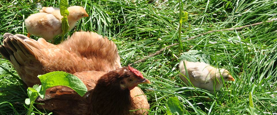
Lil' responsive image
If you want suggest a feature for YAMB or report a bug, you can write to irina@prowebdesign.ro or leave a comment on dedicated blog post. We'll be especially happy to see examples of websites, built using YAMB!:)