Lately there is a certain trend in web design for using images in geometrical shapes. Shape in-trend changes about once a year. We all remember rounded corner squares, then circles, then hexagons and octagons that used to contain Team members’ happy faces:), right? A Dribbble player rightfully popped up a question: what will be trend of 2014?
I think it will be a square rotated to 45 degrees (aka rhombus), with rounded corners. Let’s go ahead and make one with CSS.
There are, of course, several ways to do this with CSS. E.g. using clipPath with SVG. But I’d like to suggest a much simpler way.
Create a new HTML document and paste this code between the BODY tags.
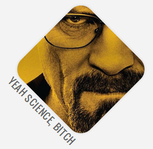
</pre>
<figure>
<div class="imagecontainer"><img alt="" src="path-to-your-image.jpg" /></div>
<figcaption>Yeah Science, Bitch</figcaption></figure>
<pre>
You can use DIV instead of FIGURE, doesn’t really matter. Now, what we will be doing with CSS is:
- Rotate IMAGECONTAINER to 45 degrees clockwise.
- And then rotate the IMG inside of it to 45 degrees counterclockwise.
This way the image container will be rotated, but the image itself will look normal, as if it’s not rotated. Paste this CSS in HEAD section of HTML, or in separate CSS file, if you are using one.
.imagecontainer{
 margin:50px auto;
 display:block;
 width:200px;
 height:200px;
 overflow:hidden;
 border-radius: 28px;
 transform: rotate(45deg);
 -ms-transform: rotate(45deg); /* IE 9 */
 -webkit-transform: rotate(45deg); /* Safari and Chrome */
 position:relative;

 /* non-essential styling */
 -webkit-box-shadow: 0px 0px 3px 3px rgba(0, 0, 0, .05);
 box-shadow: 0px 0px 3px 3px rgba(0, 0, 0, .05);

}
.imagecontainer img{
 transform: rotate(-45deg);
 -ms-transform: rotate(-45deg); /* IE 9 */
 -webkit-transform: rotate(-45deg); /* Safari and Chrome */
 position:absolute;
 top:-100px;
 left:-100px;
}
figcaption{
 transform: rotate(45deg);
 -ms-transform: rotate(45deg); /* IE 9 */
 -webkit-transform: rotate(45deg);

 /* non-essential styling */
 margin:-80px 0 0 -160px;
 font-family:'Oswald', Arial, Sans;
 font-size:20px;
 text-transform:uppercase;
 letter-spacing:.05em;
}
We have also added rounded corners to the image container. Adjust border-radius to fit your project.
Voila, here you have it. Simple! Just take care to use images with both width and height larger than your rhombus diagonal. Remember your basic geometry? 🙂 Diagonal of square: [ (side)(sqrt(2)) ]. Anyhow, here’s an online calculator.
Browser support is quite good.