Design for Mobile Devices
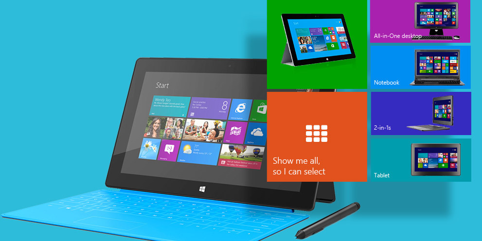
We are living in the modern age of the Internet. Anything you post on the Web will be accessed from a multitude of devices: desktop work stations, tablets, laptops, smart phones, book readers, TVs, and what nots.
Obviously, the old way of designing websites is not enough anymore.
A major shift in how we design and build websites started a while ago, and now became main stream. You have probably heard the buzz phrases responsive web design, mobile first web design. Both are part of major concept that can be called Design for mobile devices.Today, a responsive site is just a site. And “old ways” desktop site is not good enough :).
Prowebdesign first got into design for mobile devices in 2010, pretty much when the concept first appeared. We have started with responsive design, and later became experts in mobile first design and a wider area of optimizing sites and web apps for touch screens & mobile devices, including UI design for native smart phone applications.
Which mobile strategy is best for you? This decision depends on many criteria, and Prowebdesign provides free consultations to help you decide which way to go. We have also written a short article for our existing and potential clients that sheds some light on how to choose the right solution.
Contact us today and get a free project evaluation and no obligation free quote!
Design for mobile devices is not equal to responsive web design.
There are several ways to deliver quality mobile experience to your users. Mobile strategy is not the same thing as simply making a site responsive. Here is a table that lists several approaches and compares some PROs and CONs of each.
| Type | What it means | PROs | CONs |
|---|---|---|---|
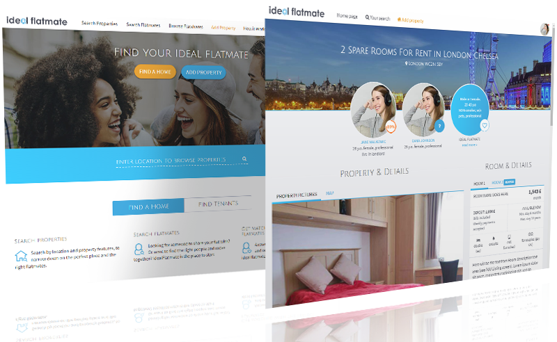
| responsive web sites | Responsive website (or app) is a site that auto-adjusts for optimal user experience on all kinds of devices. It is device- and resolution-agnostic, has fluid layout that shrinks or expands to fit into multitude of screen sizes. |
|
|
| a combination of desktop and separate mobile site | A combo of “regular” fixed size website, and another website that also has fixed width, but a small one (usually around 320 px). Second, small site, usually has reduced amount of content, functionality and pages. | This solution was used in the beginning of “mobile” era and doesn’t have to many PROs. One PRO we can name is that this is a cheap and quick fix for owners of long-existing desktop sites that want to do at least something to accommodate mobile devices. |
|
| a combo of responsive and separate mobile site. | This is a widely spread approach for large, interactive sites. The “bigger” responsive site is served to devices with relatively large screens: desktops, tablets, laptops. The “smaller”, usually also responsive, site is served to smart phones and other small devices. |
|
|
| native, hybrid, and HTML5 mobile applications | Dedicated mobile applications are best in cases when you need to use special capabilities of a certain mobile device. Like ability to take pictures, or voice recording, or GPS. And so on. Many large web businesses offer mobile applications too: Booking.com, airbnb.com, ebay.com, etc. One may argue that several mobile apps, plus responsive site, plus mobile responsive site is a serious overkill. But we do believe that those businesses based their choice on their TA preferences research. |
|
|
Which mobile strategy is best for your project?
To give an expert response to this question you need a solid web development experience. But there are several criteria that can help you narrow the field down and choose a better development team for you project.
1.Do you have visitors’ statistics?
Is your project new or existing? If it is new, skip to #2. If you have an existing website, you can make an educated decision based on your traffic statistics.
What is the percent of users who access you site/app from mobile devices? If it is over 5%, you should probably invest at least a moderate sum in improving user experience for those people.
2. The budget.
If your project is new and you have no statistics or idea about what your TA uses to browse the Web, then the first criteria is the budget. If your project is a proof of concept and you have a small budget, than simply forgo optimizing for mobile devices at first. Still look for the development team that will be able to give you a solution that can be later turned responsive or optimized for mobile with minimal effort.
If you have a small budget, but want to optimize your project for mobile anyways, than choose responsive approach. Even with all the trade offs, good development team can make responsive site or app deliver a solid mobile user experience.
If you have a good budget, make a decision about the mobile strategy based on project’s complexity and type.
3. What is the type of your project, how complex is it?
If your project mostly displays information and isn’t massively interactive, than the best fit for you is a responsive site or app. Examples of such projects:
- blog,
- online magazine,
- news portal,
- corporate website,
- company website,
- application that allows input of large amounts of data and then displays it in form of graphs or charts.
If your project has a lot of complex user interactions. Or it has a lot of auxiliary, additional functionality, or complex interactive elements like filters, maps, sliders – than you should consider having two separate sites: one responsive site for one category of devices (desktops, laptops, tablets), and another site optimized for smallest screens and slower connections. Examples of such sites or apps:
- hotel booking applications,
- large e-commerce sites,
- drag-n-drop visual configurators, etc.
4. What about mobile apps?
Go for mobile apps if you need to use native mobile capabilities, i.e. if your project is:
- a game,
- a photo-album with capability of instantly posting shots (Instagram-like),
- an activity tracker (sport apps),
- is connected with voice or music recording and immediate output, etc.
- GPS navigator or a speeding alarm.
Also, consider if you have a budget for hiring and keeping a team of developers on retainer.
Which mobile strategy is best for you? Contact us today and get a free project evaluation and no obligation free quote!